Designing effective peacebuilding programs requires access to high-quality information. Our Dimensions of Peacebuilding Dataset is the most comprehensive source of data on initiatives, policies, and institutional efforts that could influence the duration, severity, or recurrence of armed conflict.

Fund rigorous research to identify what works in conflict prevention and resolution across different contexts. We create the largest collection of peace data in the world.
Evaluate the effectiveness of peacekeeping operations, peace agreements, and transitional justice measures.
Find conflicts with the greatest need for help and the largest potential for positive impact.
Compare how two variables (such as foreign aid and conflict fatalities, or sanctions and peace agreements) move together over time across any set of countries or time periods in the data.
Use historical data on interventions and outcomes to design more effective peacebuilding programs.

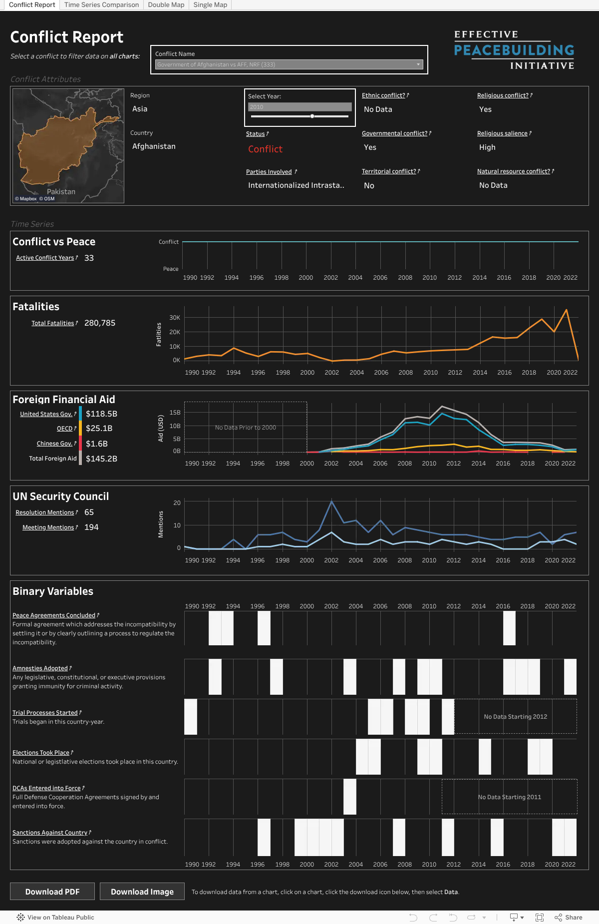
Our dashboard suite consists of four specialized visualizations, each offering unique insights into conflict dynamics. These dashboards combine various data sources to present:
Historical conflict timelines
Geographic conflict mapping
Peace process indicators
Multiple conflict variables across time
Basic Navigation
You can navigate between dashboards using the 4 tabs at the top of the embedded area. At the top of each dashboard, you’ll find interactive filters to customize your view—look for boxes with thick white borders that indicate interactive elements such as the grey dropdown boxes or selection sliders or grey dropdowns. The Conflict Report will likely require vertical scrolling to see all visualizations and access the ‘Download’ options at the bottom of the dashboard.
| Feature | Description | Conflict Report | Time Series Comparison | Double Map | Single Map |
|---|---|---|---|---|---|
| Filter by Conflict Name | Use a dropdown to select a particular conflict. | X | X | ||
| Filter by Year | Use a dropdown to select a particular year. | X | X | X | X |
| Filter by Region | Use a dropdown to select a particular region. | X | X | ||
| Filter by Country | Use a dropdown to select a particular country. | X | |||
| Select Variables | Use a dropdown to select a particular variable. | X | X | X | |
| Compare Two Variables | Use dropdown to select variables for comparison. | X | X | ||
| Animate Over Time | Use an animation control to select a year or create an animation. | X | X | ||
| Zoom and Pan Around Maps | Zoom using the scroll wheel or clicking the (+) or (-) buttons on the top lefthand side of a map and pan by clicking and dragging the mouse inside a map. | X | X | ||
| Hover for info | Hover the mouse over a chart / map for more information. | X | X | X | X |
| Download Chart-Specific Data | Click on the chart you’d like to download data for (nothing will happen after clicking), scroll to the bottom of the dashboards, click on the download icon, and then select “Data.” | X | X | X | X |
| Download Full Dataset | Above the dashboards, click the button labeled “Download the Dimensions of Peacebuilding Dataset.” | ||||
| Download Dashboard as PDF or Image | Click “Download PDF” or “Download Image” and select download settings in pop-up window. | X | X | X | X |
| View Data Source | Click on underlined text, which will open a new browser tab to the source of the data. Please see data sources for definitions of specific terms. | X | X | X | X |
Data Availability
Across all dashboards, certain variables may show “No Data” for certain years, or a line may be missing from a chart. This indicates the information wasn’t collected during that period for that conflict or that the conflict was not active during that period.
Time Series Display
In the Conflict Report dashboard, time series charts maintain a fixed time range (1990-2022). For conflicts that span only a portion of this period, the visualization will show the complete timeline with empty periods.
Map Visualization
The color coding system in maps makes the following distinctions:
These interactive dashboards leverage the Dimensions of Peacebuilding Dataset—the largest collection of data on peace and conflict in the world—to help users explore key questions about global conflicts and peacebuilding efforts. With over 34 datasets integrated in the Dimensions of Peacebuilding Dataset, our dashboards visualize where different kinds of peacebuilding efforts have been focused and how those efforts relate to trends in conflict and violence. Through these interactive dashboards, researchers, policy makers, and the public can explore and understand global conflicts across time. By making this data openly accessible and interactive, we aim to promote transparency and deeper understanding of conflict patterns and peace processes worldwide.